Beavertown Brewery
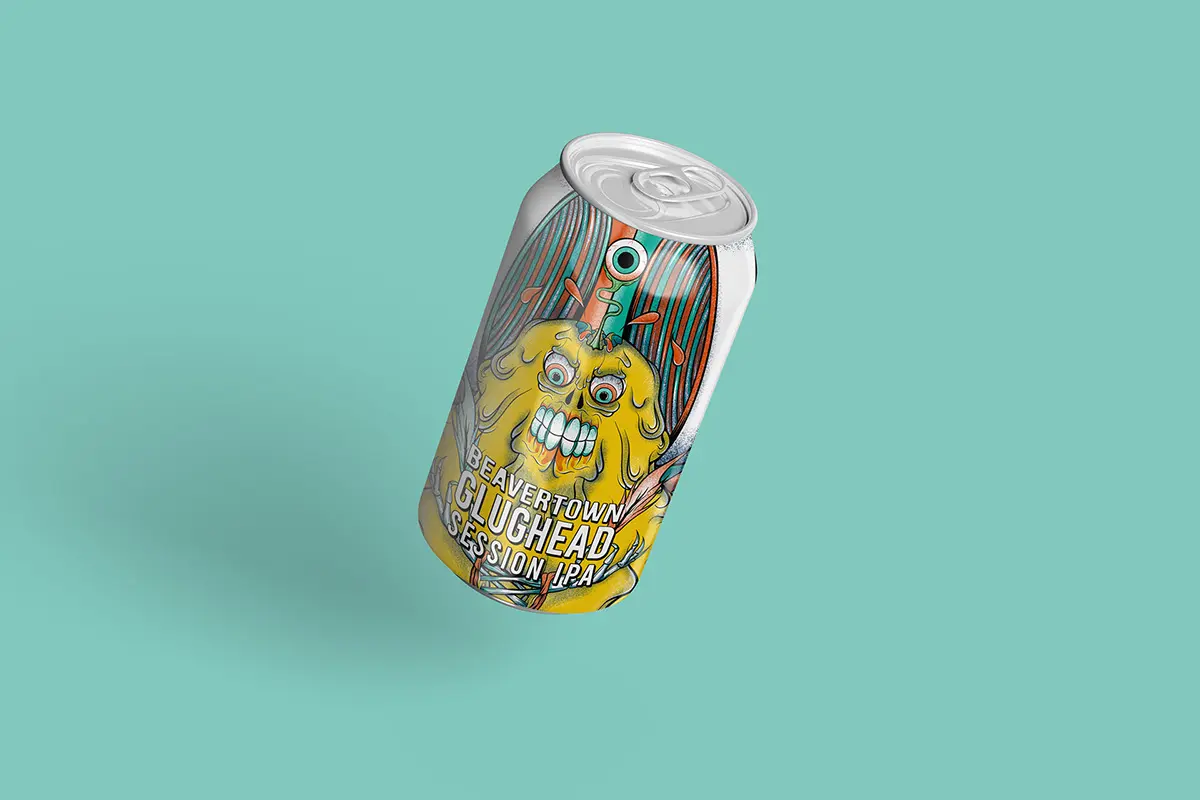
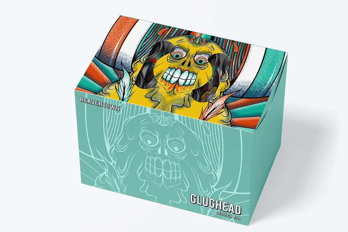
PACKAGING DESIGN CONCEPT: My aim was to create a compelling packaging design concept for Beavertown Brewery's craft beer. I began by studying their previous designs, which typically feature a skull and a range of colour schemes. By doing so, I was able to understand the visual language and aesthetic preferences of the brand.
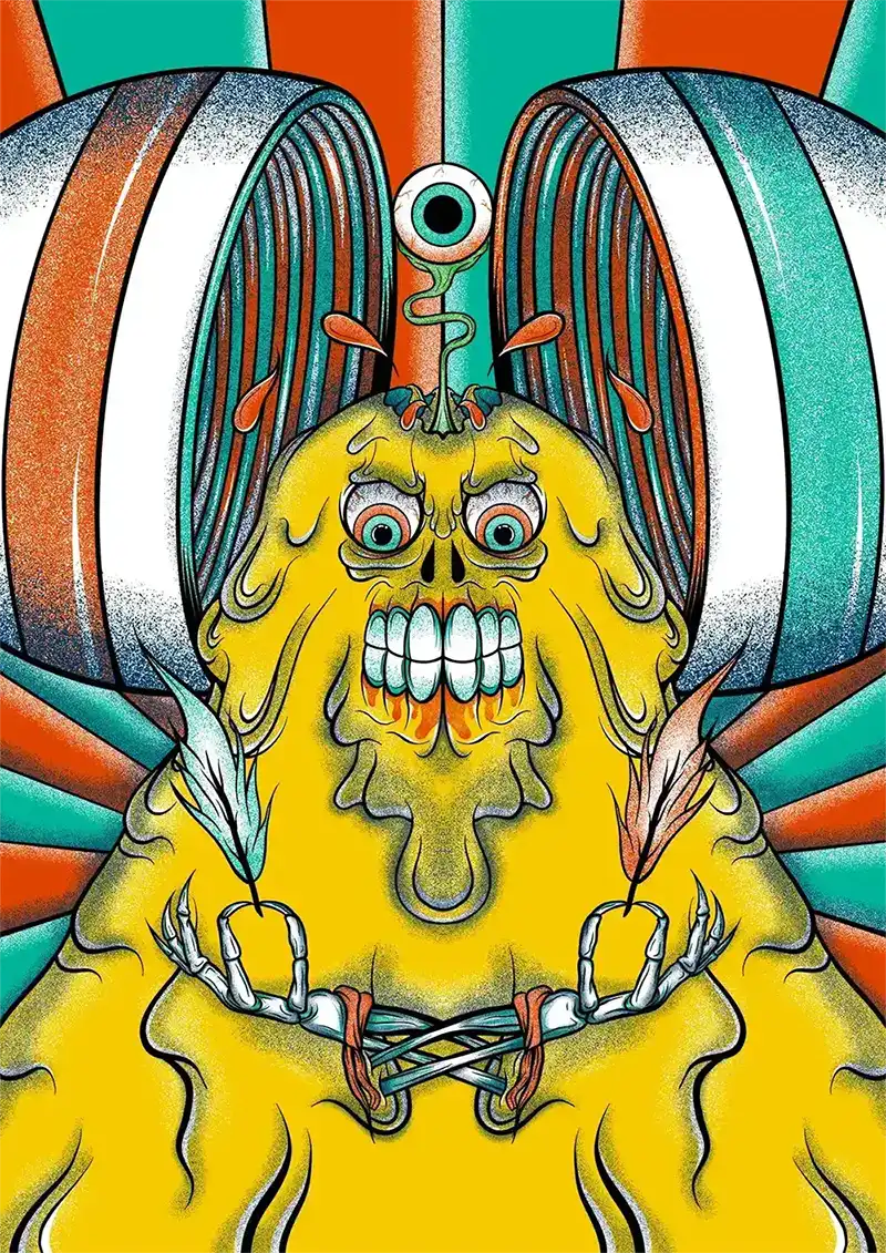
To infuse a personal touch into the design, I used an illustration that I had created during the 2020 UK lockdown. The illustration depicted liquid flowing from the subject's head, which aligned with the concept of a craft beer bottle. Given the imagery, I chose the name "Glughead," which not only referenced the gurgling sound of liquid pouring from a bottle but also added an element of playfulness to the design.
In terms of colour and typography, I utilized bold and vibrant elements that would stand out on the shelves and attract the attention of potential customers. The use of complementary colours and a legible font added to the overall cohesiveness of the design.
The result was a visually striking and memorable packaging design concept that effectively captured the essence of Beavertown Brewery's brand. By incorporating a unique illustration and playful name, I was able to add a fresh and exciting dimension to the brand's existing designs.